
Category: UX/UI design
Role: Lead product designer
Year: 2018
Overview
As a growth team designer on the Yahoo Mail app, my focus was increasing user retention. I designed the early stage of our app experience including the login process, onboarding experiences, and solved discovery issues to gain user retention.
Goal
The goal was to increase the onboarding completion rate, which was a 52% at that time. Considering the fact that 1% of daily app usage increase in 28-days equals 4.8 m DAUs up, there was a huge opportunity from a growth perspective.
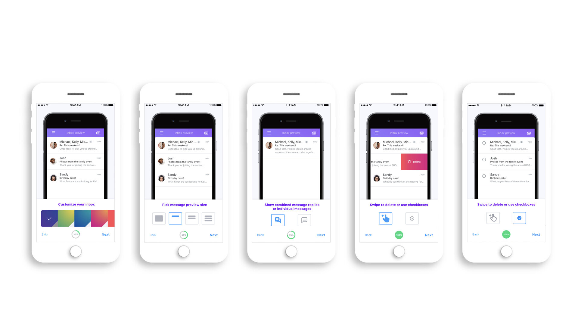
Message list customization
As a part of the onboarding process, we wanted to feature a message list customization, which was one of the unique features only available in Yahoo Mail. From our research data, we observed that users who completed the personalization process of their inboxes more frequently engaged with a product. We decided to promote the personalization part and entice users during the onboarding process.

We tested this with the text version, saying 1 line or 2 lines. However, users tended to go to the next item right away. They did appreciate the fact that they could select a preview size. Since people tend to skip large chunks of text, I added visual elements to symbolize 1 line or 2 lines to help users understand the onboarding process better.

Users don’t understand the meaning of “Avatars”, “Profile photos” or “Checkboxes.” I decided to demonstrate the difference by using a deleting function. Users who like to swipe messages to delete will have their photos on. Users who multi-select to delete will have blank checkboxes, instead of having profile photos.

Final design
When we launched a bucket testing for this onboarding experiment, it was really successful. The standard P-value that defines success is 0.5 and the lower the number, the better the result. My message list customization experiment was measured as 0.1, which was a significant result.
In addition to the bucket testing, we also conducted an in-lab user study to see participants’ reactions when they interacted with three layout options. During the in-lab study, we learned that user behavior was connected deeply with the muscle memory and thumb-zone where users could reach tappable options easily.
Exploration 1
Placed the options on the top and a “Next“ and “Back“ button below. Users seemed to skip this option because there was a long distance between the option area and the “Next“ button. They needed to move their fingers again to move on to the next step. And it required more time to finish the onboarding process.

Exploration 2
Even though the tappable options and the “Next“ button were grouped together, the elements were located on the top and it was too far away from the thumb-zone where users could easily reach to without moving their hands.

Key results
The onboarding completion rate increased from 52% to 69%.
We saw the highest ever DAUs at 9.46M, which shows that our Year-over-Year growth was more than 41%.